Proprietà CSS justify-content
Scopri la proprietà justify-content che definisce la posizione degli elementi nel contenitore flex o grid, con valori ed esempi pratici.
La proprietà justify-content distribuisce lo spazio rimanente lungo l'asse principale di un contenitore flex (o grid), controllando come gli elementi vengono distanziati e allineati quando non riempiono l'intera riga. È una sotto-proprietà del modulo Flexible Box Layout e una delle proprietà CSS3.
Questa pagina spiega cos'è l'asse principale, illustra ogni valore con un esempio eseguibile e presenta le insidie da tenere a mente.
Perché l'asse principale è importante
justify-content ha effetto solo lungo l'asse principale — la direzione in cui scorrono gli elementi flex. Tale direzione viene impostata tramite flex-direction:
flex-direction: row(predefinito) → l'asse principale va da sinistra a destra, quindijustify-contentsposta gli elementi orizzontalmente.flex-direction: column→ l'asse principale va dall'alto verso il basso, quindi lo stesso valore dijustify-contentsposta gli elementi verticalmente.
Per allineare gli elementi sull'asse trasversale (la direzione perpendicolare) usa invece align-items, mentre per distanziare le righe flex avvolte usa align-content. Un errore comune per chi inizia è usare justify-content per centrare qualcosa verticalmente in un contenitore row predefinito — quello è il compito di align-items.
justify-content ha effetto solo quando il contenitore è un contenitore flex (o grid) — ossia quando la proprietà display è impostata su flex o grid. Su un contenitore block normale non fa nulla.
| Valore iniziale | flex-start |
|---|---|
| Si applica a | Contenitori flex. |
| Ereditato | No. |
| Animabile | No. |
| Versione | CSS3 |
| Sintassi DOM | object.style.justifyContent = "center"; |
Sintassi
Sintassi CSS justify-content
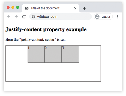
justify-content: flex-start | flex-end | center | space-between | space-around | space-evenly | initial | inherit;Esempio della proprietà justify-content:
Esempio di codice CSS justify-content
<!DOCTYPE html>
<html>
  <head>
    <title>Title of the document </title>
    <style>
      .center {
        width: 400px;
        height: 150px;
        border: 1px solid #666;
        display: flex;
        justify-content: center;
      }
      .center div {
        width: 70px;
        height: 70px;
        background-color: #ccc;
        border: 1px solid #666;
      }
    </style>
  </head>
  <body>
    <h2>Justify-content property example</h2>
    <p>Here the "justify-content: center" is set:</p>
    <div class="center">
      <div>1</div>
      <div>2</div>
      <div>3</div>
    </div>
  </body>
</html>Risultato
Esempio della proprietà justify-content con il valore "flex-start":
Esempio CSS justify-content flex-start
<!DOCTYPE html>
<html>
  <head>
    <title>Title of the document </title>
    <style>
      .start {
        width: 400px;
        height: 150px;
        border: 1px solid #666;
        display: flex;
        justify-content: flex-start;
      }
      .start div {
        width: 70px;
        height: 70px;
        background-color: #ccc;
        border: 1px solid #666;
      }
    </style>
  </head>
  <body>
    <h2>Justify-content property example</h2>
    <p>Here the "justify-content: flex-start" is set:</p>
    <div class="start">
      <div>1</div>
      <div>2</div>
      <div>3</div>
    </div>
  </body>
</html>Esempio della proprietà justify-content con il valore "flex-end":
Esempio CSS justify-content flex-end
<!DOCTYPE html>
<html>
  <head>
    <title>Title of the document </title>
    <style>
      .end {
        width: 400px;
        height: 150px;
        border: 1px solid #666;
        display: flex;
        justify-content: flex-end;
      }
      .end div {
        width: 70px;
        height: 70px;
        background-color: #ccc;
        border: 1px solid #666;
      }
    </style>
  </head>
  <body>
    <h2>Justify-content property example</h2>
    <p>Here the "justify-content: flex-end" is set:</p>
    <div class="end">
      <div>1</div>
      <div>2</div>
      <div>3</div>
    </div>
  </body>
</html>Esempio della proprietà justify-content con il valore "space-between":
Esempio CSS justify-content space-between
<!DOCTYPE html>
<html>
  <head>
    <title>Title of the document </title>
    <style>
      .space-between {
        width: 400px;
        height: 150px;
        border: 1px solid #666;
        display: flex;
        justify-content: space-between;
      }

      .space-between div {
        width: 70px;
        height: 70px;
        background-color: #ccc;
        border: 1px solid #666;
      }
    </style>
  </head>
  <body>
    <h2>Justify-content property example</h2>
    <p>Here the "justify-content: space-between" is set:</p>
    <div class="space-between">
      <div>1</div>
      <div>2</div>
      <div>3</div>
    </div>
  </body>
</html>Esempio della proprietà justify-content con il valore "space-around":
Esempio CSS justify-content space-around
<!DOCTYPE html>
<html>
  <head>
    <title>Title of the document </title>
    <style>
      .space-around {
        width: 400px;
        height: 150px;
        border: 1px solid #666;
        display: flex;
        justify-content: space-around;
      }
      .space-around div {
        width: 70px;
        height: 70px;
        background-color: #ccc;
        border: 1px solid #666;
      }
    </style>
  </head>
  <body>
    <h2>Justify-content property example</h2>
    <p>Here the "justify-content: space-around" is used:</p>
    <div class="space-around">
      <div>1</div>
      <div>2</div>
      <div>3</div>
    </div>
  </body>
</html>Esempio della proprietà justify-content con il valore "space-evenly":
Con space-evenly gli spazi prima del primo elemento, tra ogni elemento e dopo l'ultimo elemento sono tutti uguali. (Con space-around gli spazi esterni sono soltanto la metà degli spazi tra gli elementi, mentre space-between non ha spazi esterni.)
<!DOCTYPE html>
<html>
  <head>
    <title>Title of the document </title>
    <style>
      .space-evenly {
        width: 400px;
        height: 150px;
        border: 1px solid #666;
        display: flex;
        justify-content: space-evenly;
      }
      .space-evenly div {
        width: 70px;
        height: 70px;
        background-color: #ccc;
        border: 1px solid #666;
      }
    </style>
  </head>
  <body>
    <h2>Justify-content property example</h2>
    <p>Here the "justify-content: space-evenly" is used:</p>
    <div class="space-evenly">
      <div>1</div>
      <div>2</div>
      <div>3</div>
    </div>
  </body>
</html>Cose da tenere a mente
justify-contentnon fa nulla a meno che il genitore non sia un contenitore flex o grid (display: flex/display: grid).- Le tre parole chiave "space" differiscono solo negli spazi esterni:
space-betweennon ne ha,space-aroundfornisce spazi esterni dimezzati,space-evenlyrende tutti gli spazi uguali. - L'asse su cui agisce segue flex-direction. Passando a
column, lo stesso valore funziona dall'alto verso il basso. - Ha importanza solo quando c'è spazio libero rimanente. Se gli elementi riempiono già (o eccedono) l'asse principale, l'allineamento non ha nulla da distribuire.
Valori
| Valore | Descrizione | Prova |
|---|---|---|
| flex-start | Gli elementi partono dall'inizio del contenitore. | Prova » |
| flex-end | Gli elementi vengono posizionati alla fine del contenitore. | Prova » |
| center | Gli elementi vengono posizionati al centro del contenitore. | Prova » |
| space-around | C'è spazio prima, tra e dopo gli elementi. | Prova » |
| space-between | C'è spazio tra gli elementi. | Prova » |
| space-evenly | C'è uno spazio uguale prima, tra e dopo gli elementi. | Prova » |
| initial | Imposta la proprietà al suo valore predefinito. | Prova » |
| inherit | Eredita la proprietà dall'elemento genitore. |
Pratica
Proprietà correlate
- align-items — allinea gli elementi lungo l'asse trasversale.
- align-content — distanzia le righe flex avvolte lungo l'asse trasversale.
- flex-direction — imposta quale asse è l'asse principale.
- The Ultimate Guide to Flexbox — l'intero modello Flexbox in un unico posto.